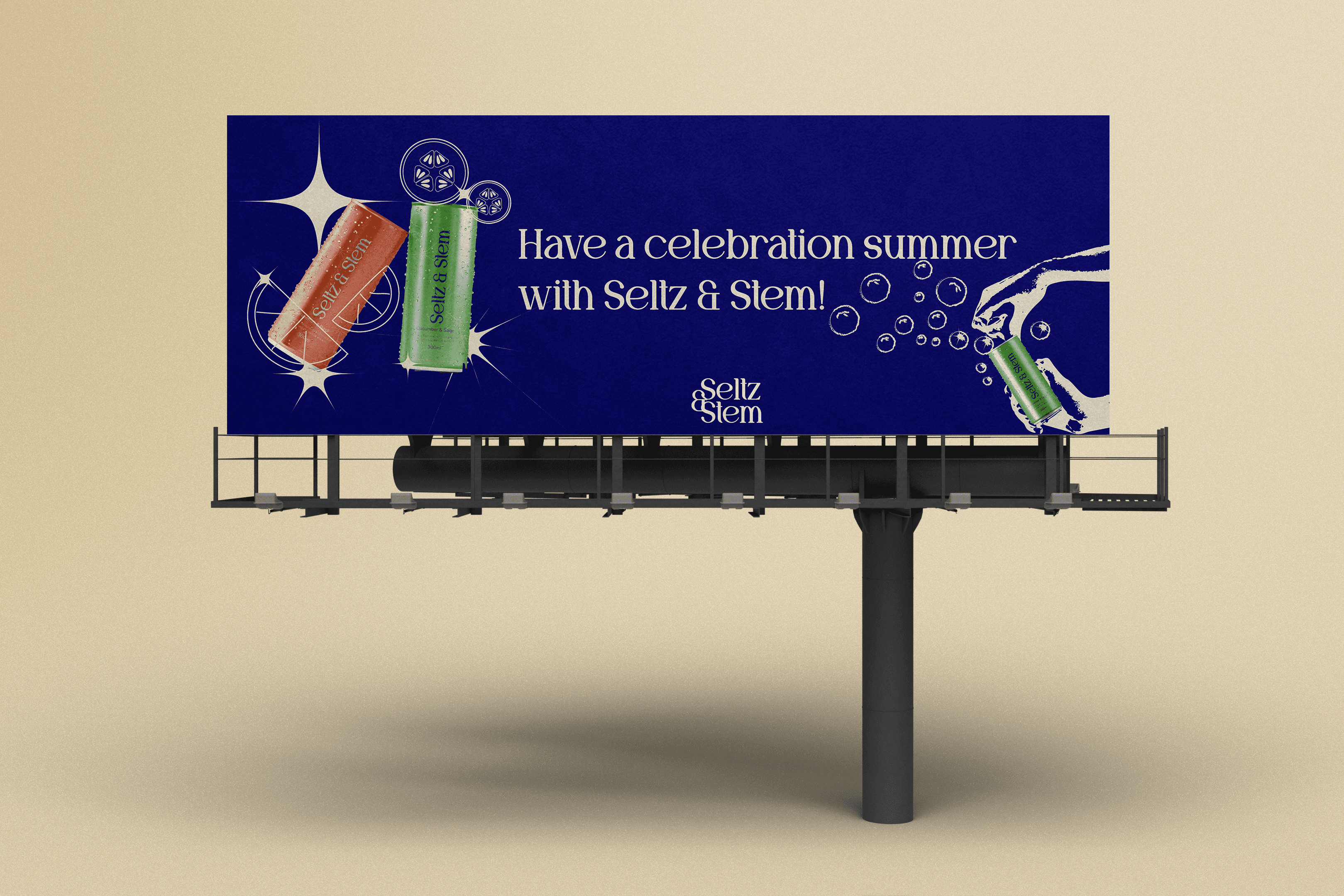
Branding
Sezela Sugar
Sezela Sugar is a community-centered sugar brand designed for underprivileged households, focusing on accessibility, simplicity, and trust through thoughtful communication design.
Year :
2025
Industry :
Food Manufacturing
Client :
Sezela Sugar
Project Duration :
4-5 weeks

Problem :
Access to affordable, quality food products remains a challenge for many underprivileged communities. Sugar is a basic household staple, yet existing brands often prioritize premium packaging and pricing over accessibility. As a result, lower-income consumers are left with limited options that feel impersonal, low quality, or visually neglected.
There was a need for a sugar brand that feels trustworthy, dignified, and accessible while still communicating warmth and care through design.
Solution :
Sezela Sugar was created as a community-focused brand designed to serve less privileged households with affordable, reliable sugar.
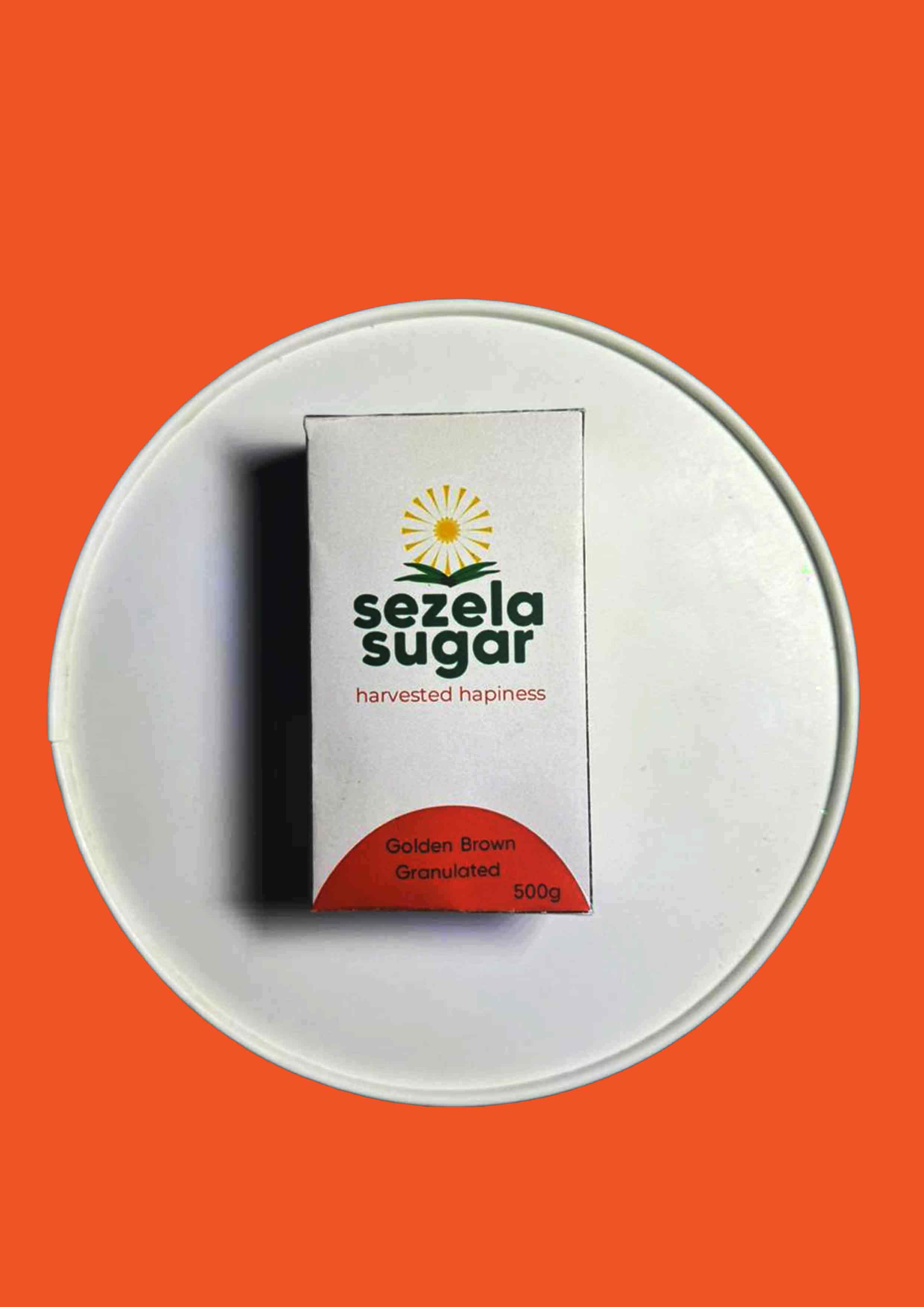
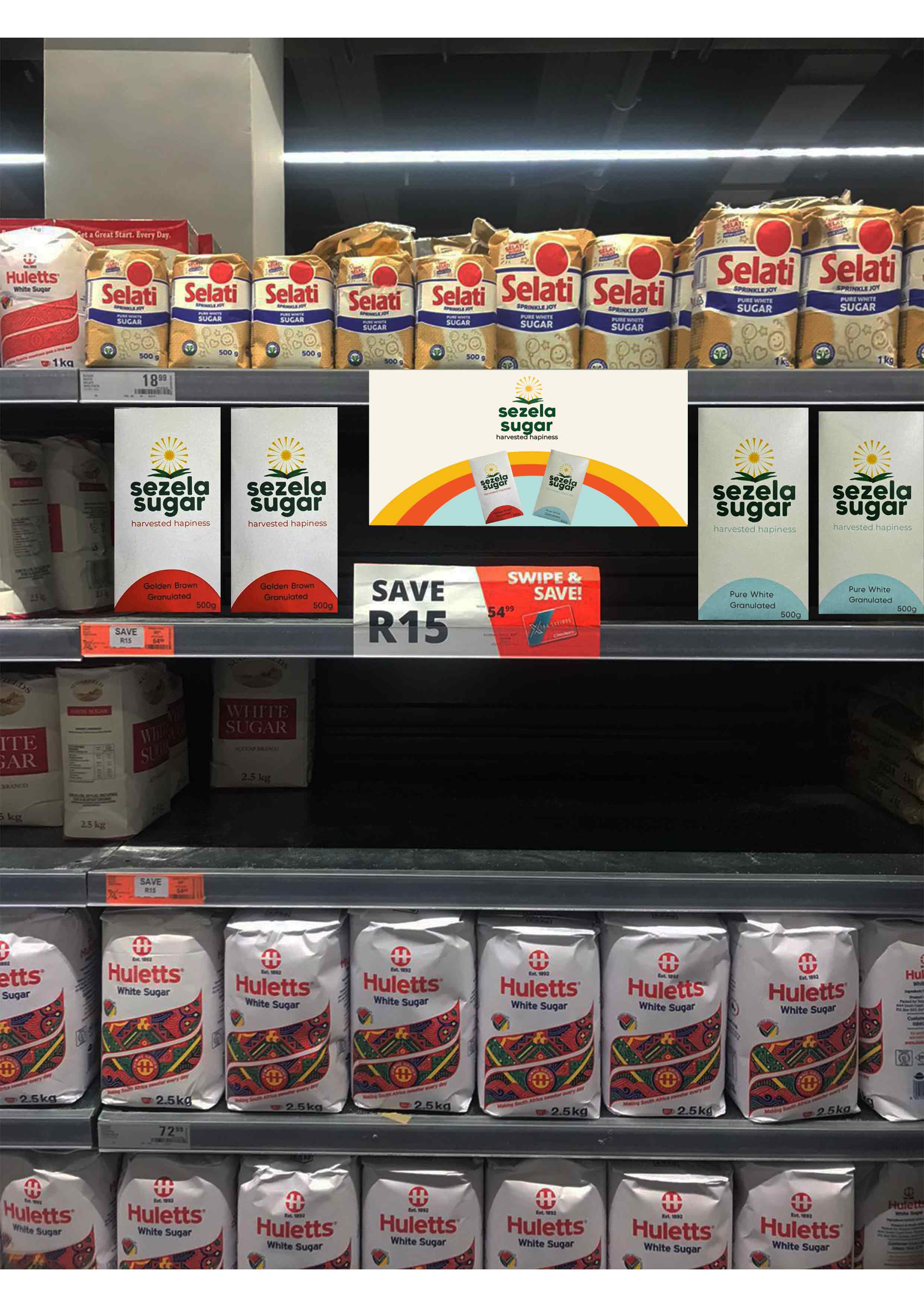
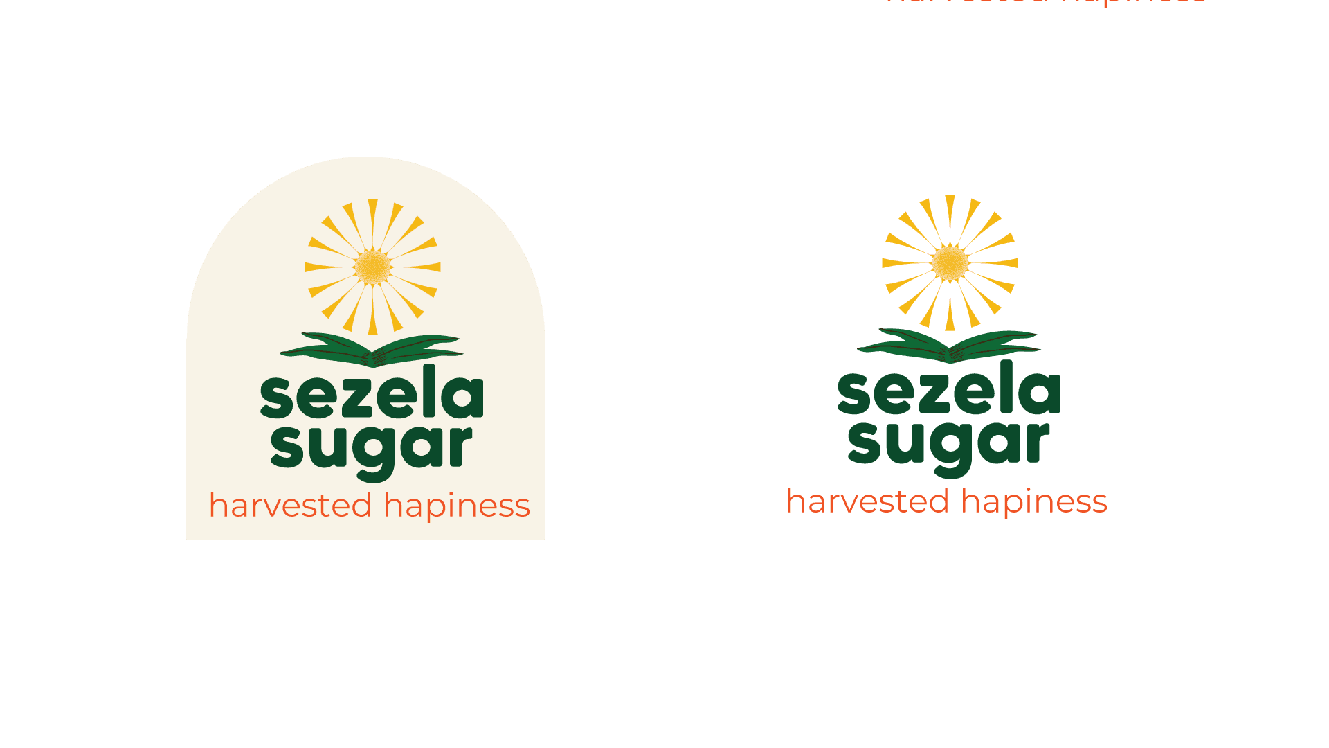
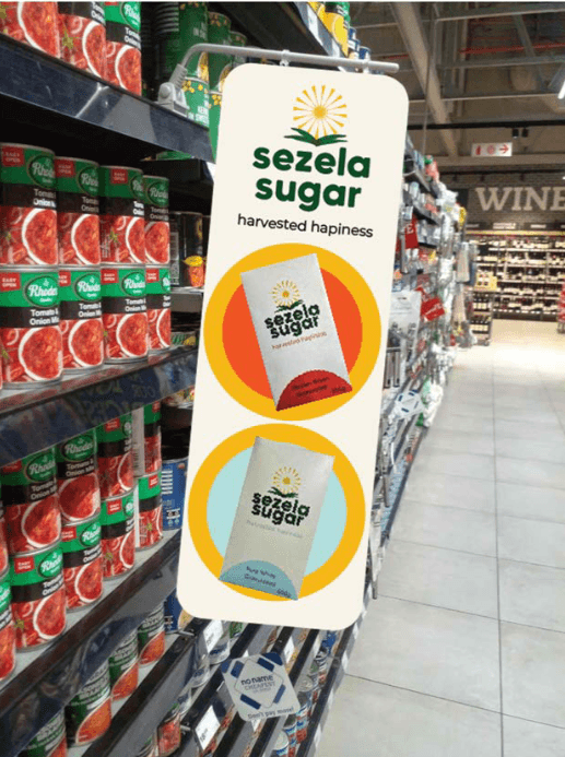
Through communication design, I developed a visual identity that feels simple, friendly, and honest. The branding focuses on clarity, warmth, and approachability, using clean layouts and thoughtful typography to build trust and familiarity. The goal was to show that essential products can still be well-designed and respectful of their users.

Challenge :
Designing for affordability while maintaining strong visual identity
Creating packaging that feels warm and human, not generic
Communicating trust and quality through minimal design elements
Balancing simplicity with brand personality
Ensuring the brand speaks to everyday users in an inclusive way
Summary :
Sezela Sugar is a branding project rooted in social impact and accessibility. The project explores how communication design can elevate everyday products while remaining affordable and inclusive. By creating a warm and straightforward visual identity, Sezela Sugar aims to support communities with a product that feels reliable, approachable, and human — reinforcing the idea that good design should be available to everyone.
More Projects


Branding
Sezela Sugar
Sezela Sugar is a community-centered sugar brand designed for underprivileged households, focusing on accessibility, simplicity, and trust through thoughtful communication design.
Year :
2025
Industry :
Food Manufacturing
Client :
Sezela Sugar
Project Duration :
4-5 weeks
Problem :
Access to affordable, quality food products remains a challenge for many underprivileged communities. Sugar is a basic household staple, yet existing brands often prioritize premium packaging and pricing over accessibility. As a result, lower-income consumers are left with limited options that feel impersonal, low quality, or visually neglected.
There was a need for a sugar brand that feels trustworthy, dignified, and accessible while still communicating warmth and care through design.
Solution :
Sezela Sugar was created as a community-focused brand designed to serve less privileged households with affordable, reliable sugar.
Through communication design, I developed a visual identity that feels simple, friendly, and honest. The branding focuses on clarity, warmth, and approachability, using clean layouts and thoughtful typography to build trust and familiarity. The goal was to show that essential products can still be well-designed and respectful of their users.
Challenge :
Designing for affordability while maintaining strong visual identity
Creating packaging that feels warm and human, not generic
Communicating trust and quality through minimal design elements
Balancing simplicity with brand personality
Ensuring the brand speaks to everyday users in an inclusive way
Summary :
Sezela Sugar is a branding project rooted in social impact and accessibility. The project explores how communication design can elevate everyday products while remaining affordable and inclusive. By creating a warm and straightforward visual identity, Sezela Sugar aims to support communities with a product that feels reliable, approachable, and human — reinforcing the idea that good design should be available to everyone.
More Projects
Branding
Sezela Sugar
Sezela Sugar is a community-centered sugar brand designed for underprivileged households, focusing on accessibility, simplicity, and trust through thoughtful communication design.
Year :
2025
Industry :
Food Manufacturing
Client :
Sezela Sugar
Project Duration :
4-5 weeks
Problem :
Access to affordable, quality food products remains a challenge for many underprivileged communities. Sugar is a basic household staple, yet existing brands often prioritize premium packaging and pricing over accessibility. As a result, lower-income consumers are left with limited options that feel impersonal, low quality, or visually neglected.
There was a need for a sugar brand that feels trustworthy, dignified, and accessible while still communicating warmth and care through design.
Solution :
Sezela Sugar was created as a community-focused brand designed to serve less privileged households with affordable, reliable sugar.
Through communication design, I developed a visual identity that feels simple, friendly, and honest. The branding focuses on clarity, warmth, and approachability, using clean layouts and thoughtful typography to build trust and familiarity. The goal was to show that essential products can still be well-designed and respectful of their users.
Challenge :
Designing for affordability while maintaining strong visual identity
Creating packaging that feels warm and human, not generic
Communicating trust and quality through minimal design elements
Balancing simplicity with brand personality
Ensuring the brand speaks to everyday users in an inclusive way
Summary :
Sezela Sugar is a branding project rooted in social impact and accessibility. The project explores how communication design can elevate everyday products while remaining affordable and inclusive. By creating a warm and straightforward visual identity, Sezela Sugar aims to support communities with a product that feels reliable, approachable, and human — reinforcing the idea that good design should be available to everyone.